
[Python] Graph 그리기 (Matplotlib)
Python에서 그래프를 그릴 때 가장 많이 사용하는 패키지로 Matplotlib이 있다.
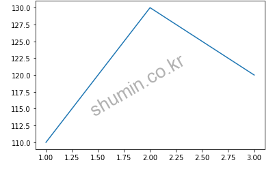
%matplotlib inline # jupyter에서 사용하는 magic command로 notebook 내부에 그림을 표시하도록 지정
from matplotlib import pyplot as plt

plt.plot([1,2,3], [110,130,120])
plt.show()
1. Color, Marker, Line Style
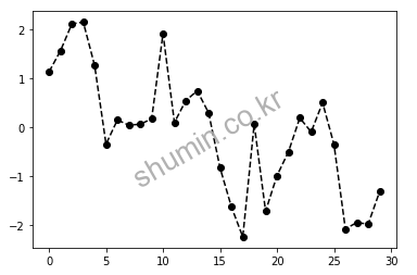
그래프의 모습을 색, 점, 선 등의 스타일을 변경할 수 있다.
from matplotlib import pyplot as plt
import numpy as np
plt.plot(np.random.randn(30).cumsum(), color='k', linestyle='dashed', marker='o')
1-1. Color
| Character | Color |
|---|---|
| ‘b’ | Blue |
| ‘g’ | Green |
| ‘r’ | Red |
| ‘c’ | Cyan |
| ‘m’ | Magenta |
| ‘y’ | Yellow |
| ‘k’ | Black |
| ‘w’ | White |
1-2. Marker
| Character | Description |
|---|---|
| ‘-‘ | 1선 |
| ‘–‘ | Dash |
| ‘-.’ | Dash-dot line |
| ‘:’ | Dotted line |
1-3. Line
| Character | Description |
|---|---|
| ‘.’ | Point marker |
| ‘,’ | Pixel marker |
| ‘o’ | Circle marker |
| ‘v’ | Triangle down marker |
| ‘^’ | Triangle up marker |
| ‘<‘ | Triangle left marker |
| ‘>’ | Triangle right marker |
| ‘s’ | Square marker |
| ‘p’ | Pentagon marker |
| ‘*’ | Star marker |
| ‘+’ | Plus marker |
| ‘x’ | X marker |
| ‘D’ | Diamond marker |
2. Label
X, Y축 이름, 제목을 다음과 같이 붙일 수 있다.
plt.xlabel(["X축 이름"])
plt.ylabel(["Y축 이름"])
plt.title(["그래프 제목"])
from matplotlib import pyplot as plt

plt.plot(["Seoul", "Paris", "Beijing"], [30, 25, 55])
plt.xlabel('City')
plt.ylabel('Response')
plt.title('Experiment Result')
plt.show()
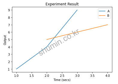
3. Legend (범례)
plt.legend(["X축 legend", "Y축 legend"])
from matplotlib import pyplot as plt

plt.plot([1, 2, 3], [1, 4, 9])
plt.plot([2, 3, 4], [5, 6, 7])
plt.xlabel('Time (secs)')
plt.ylabel('Output')
plt.title('Experiment Result')
plt.legend(['A', 'B'])
plt.show()
4. Figure 구조
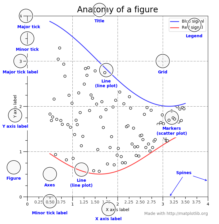
- Title: 제목
- Grid: 보조선
- Tick: 눈금
- Legend: 범례
- Label: 축 이름
- Markers: 점
- Line: 선
- Axis: x축, y축에 대한 눈금과 lebel을 가짐
- Axes: 그래프가 그려지는 좌표 평면으로 하나의 figure에 1개 이상의 axes가 존재 할 수 있음 (subplot)
5. 파일로 저장
활성화된 figure는 plt.savefig 메소드를 이용해서 파일로 저장 할 수 있다.
# plt.savefig("파일명", dpi=해상도, bbox_inches=주위 공백)
plt.savefig("figure.png", dpi=400, bbox_inches="tight")
6. OOP Style vs. pyplot Style
따로 객체를 만들지 않고 plot을 그리는 방법은 다음과 같다.
x = np.linspace(0, 2, 100)

plt.plot(x, x, label='linear')  # Plot some data on the (implicit) axes.
plt.plot(x, x**2, label='quadratic')  # etc.
plt.plot(x, x**3, label='cubic')
plt.xlabel('x label')
plt.ylabel('y label')
plt.title("Simple Plot")
plt.legend()
반대로 plt object를 만들어서 그림과 축을 만드는 메서드를 호출하는 방법은 다음과 같다.
x = np.linspace(0, 2, 100)

# Note that even in the OO-style, we use `.pyplot.figure` to create the figure.
fig, ax = plt.subplots()  # Create a figure and an axes.
ax.plot(x, x, label='linear')  # Plot some data on the axes.
ax.plot(x, x**2, label='quadratic')  # Plot more data on the axes...
ax.plot(x, x**3, label='cubic')  # ... and some more.
ax.set_xlabel('x label')  # Add an x-label to the axes.
ax.set_ylabel('y label')  # Add a y-label to the axes.
ax.set_title("Simple Plot")  # Add a title to the axes.
ax.legend()  # Add a legend.
Reference
- https://sosomemo.tistory.com/61